Royal College of Paediatrics and Child Health
Planning a new site for the UK's leading organisation for paediatricians and child health.
1 February 2019
Overview
Royal College for Paediatric and Child Health (RCPCH) are the premier training and accreditation body for paediatricians and child health practitioners in the UK.
Challenge
The challenge was to re-develop the RCPCH’s website, improving every aspect of it, from updating the content to re-platforming on a modern CMS. Content was hard to find, the site wasn’t optimised for mobile, and editors found it difficult to use.
Solution
Being a large organisation, the site is used by a huge range of people, including researchers, internal teams, practicing and retired paediatricians, students and even parents. It was essential therefore that the new site would support their journeys and help them meet their goals. These included logging professional development, registering for exams and getting results, publishing research papers and finding information on medicines and health conditions.
User research
I spent over six weeks conducting user interviews with a wide range of stakeholders and user groups to explore their needs, goals and pain points.
From these interviews I developed hundreds of user stories which summed up all the many ways people might want to use the site. In workshops held with each stakeholder group, we grouped these stories into epics and ranked them by importance. These epics formed the site's core user journeys and directly informed the content strategy and information architecture.
Content strategy
The old site had over five thousand pages and many more PDFs, from clinical guidelines, to research papers, to articles and advice guides. We made the decision early on that PDF content should be re-publised as site content, to improve accessibility and SEO. Each of these pieces would need categorising and migrating to the new site manually as they were too complex to automate.
I conducted a full content audit, indexing every page and linked document, cross-referencing it against traffic stats for the last year. Any page with five or less views I marked as a potential candidate for deletion. And, working with the RCPCH web team, we determined which content could be migrated directly or would need a re-write. Each team was responsible for their own content, so the decision to delete or re-write content was quite politically sensitive.
With a full understanding of the content, I created a set of content types and templates. The old site only had one content type – the page – which meant it was being used for many different things with no consistent structure.

↑ Example content type definitions, showing permissions, fields, taxonomies and display views.
Content types are defined by the purpose of each piece of content, for example an article content type may have tag and author field whereas an event may have date and location fields.
I also created a new taxonomy structure to categorise content, using card-sorting techniques with stakeholder and user groups to ensure they were properly validated. Combined with content types, this would be used to sort and view content in various ways – for example to show related articles on a certain topics.
Information architecture
Based on the content strategy and the user stories outcomes of the user interviews and the content strategy, I created a site map that showed where the new content types would fit into the site structure. Then, working with the development team, I developed a series of process and entity relationship diagrams, detailing key pieces of functionality and how the site would interact with outside systems.
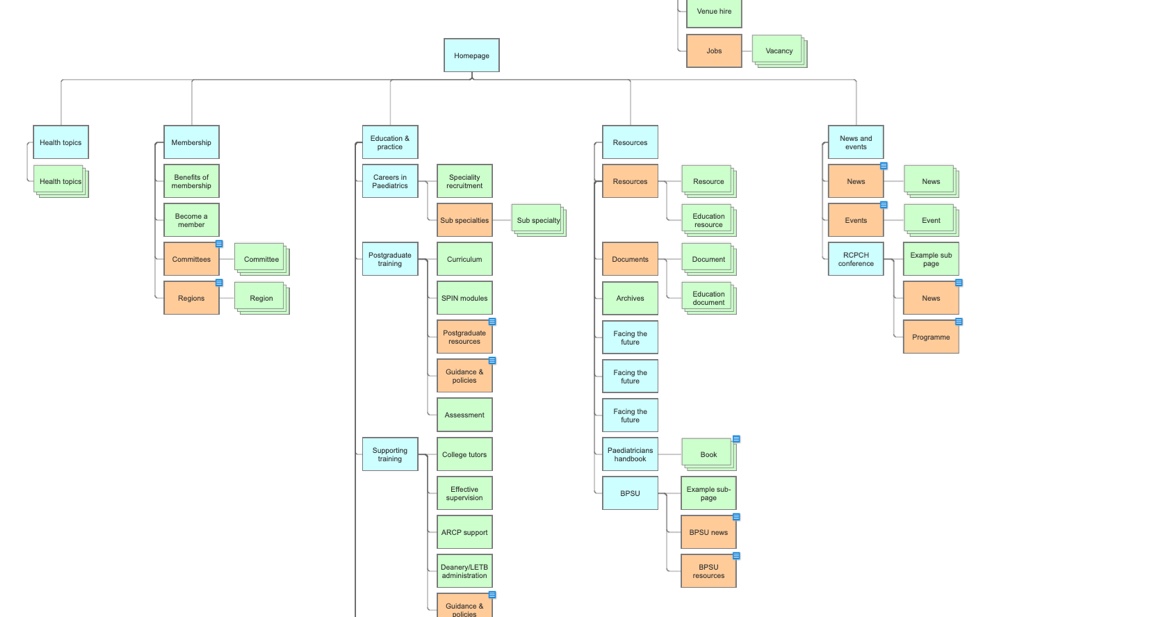
↑ Sitemap showing page hierarchy and content types.
Wireframing & prototyping
From this, I was able to create a set of pixel-perfect mobile-first, responsive wireframes, covering page hierarchy, content types, listings, challenging functionality, such as search, and key landing pages.

↑ Homepage and topic hub.
These wireframes formed the blueprints of the site that the developers used to build the site from, so they had to be completely accurate in how they described the site features and functionality.

↑ User dashboard and example content page.
User testing
I conducted a series of user tests with each user group to validate the information architecture. The tests looked at how easy it was to navigate through the content structure and whether they could find the information or functionality on the page.
Tree testing
The goal of these tests were to validate the proposed content structure and taxonomy. I gave each user group a series of tasks, asking them to show where they would expect to find certain pieces of content. The examples below show the results of giving two different user groups the same task, demonstrating that not everyone expects to find the same thing in the same place.
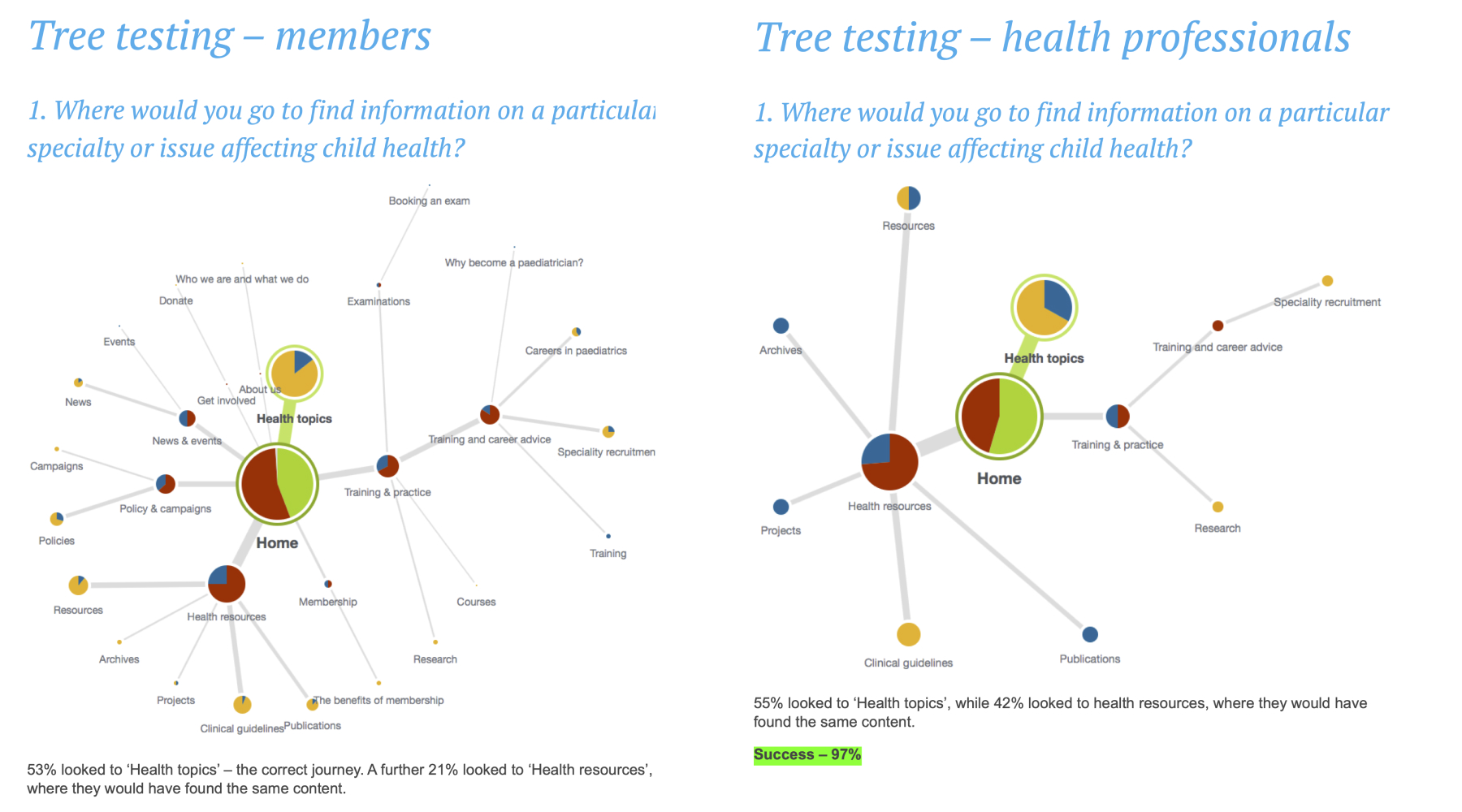
↑ Tree testing results.
First-click testing
Users were set a goal, for example to click where they would expect to find a certain type of content to access a feature. Where they click is recorded as a heatmap on the wireframe, demonstrating how easy or hard they found it to achieve the goal.

↑ Example first-click testing results.
The final deliverable from the UX process was a document containing detailed information about every aspect of the new site, including content types, fields, taxonomy, user roles and permissions, user flows, entity relationships, data security and more. This became the specification for the site, helping the client understand exactly what the new site would be like and how it worked, and also became the detailed blueprint for the developers to build from.
Handover and development
Once the client had signed off the UX, I worked closely with the design team to complete the visual design, using an atomic, component-based approach, and the development team to implement the plans correctly.
Once development was complete, RCPCH had the substantial task of publishing their content into the new site. We trained a representative from each team on the CMS, every team being responsible for re-writing and publishing their own content. This took at least a year to complete as there was so much to do.
Outcome
This was one of the largest and smoothest projects I was involved in, despite the large numbers of competing stakeholders and priorities. I believe it was successful becasue of the excellent communication, not just between RCPCH and the agency, but inside RCPCH itself. Every team was involved in the project throughout and had a direct stake in its success.
The site launched in March 2018.