Mumsnet site navigation
Increasing click-through rates by 200% by creating a new, consistent, sitewide navigation structure.
6 March 2019
Background
Mumsnet is the UK’s largest parenting website, and one of the UK’s largest websites, with over 1.2 billion annual pageviews. With the aim of making lives easier for parents, the website consists of a lively community forum, plus articles and videos on a wide range of parenting and non-parenting issues.
Challenge
The site was over 20 years old and over the years new sections, features and pages had been added in a variety of technologies and frameworks. Older parts of the site were desktop-only, some areas had a separate mobile theme, while more recent sections were fully responsive. Fonts, design and layout changed between sections. In total, there were seven unique headers and three footers. The mobile version of some pages had a different menu structure to the desktop version.
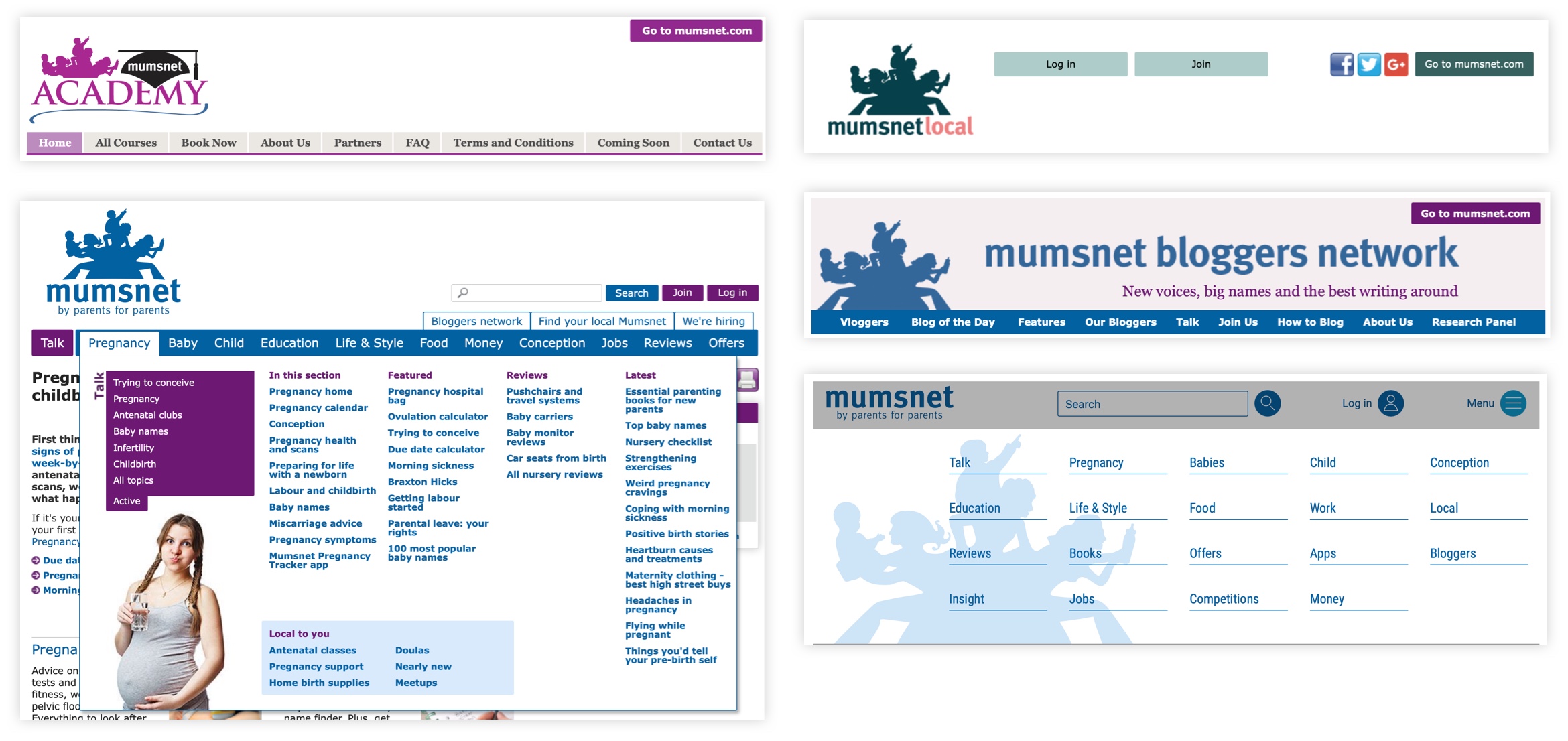
↑ A selection of the different headers and menus from across the site.
Analytics showed that the vast majority of traffic went to either the forum or a few top-level content pages. The rest of the site had very few views even though there were hundreds of pages of content, and the views that did arrive came via search rather than through browsing.
From this, our hypothesis was that users weren't browsing the site because the navigation was so inconsistent - people weren't able to build a coherent mental model. Additionally we believed the inconsistency was hurting SEO as crawlers couldn't index the site effectively as the navigation changed depending on the page being looked at.
My challenge was to create a consistent header and footer that could be rolled out across the site, irrespective of the underlying technology or front-end framework.
Solution
Data and content strategy
It was vital that the new navigation made sense from a user perspective, rather than reflecting the organisation structure. To do this I used analytics data to group together the most popular topics. These became the top-level menu items, and the most popular subjects within each became the second and third level items.
I then conducted a content audit, creating an index of every hub and content page on the site. Working with the content team, we decided which pages would go into each topic, creating a site map content hierarchy.
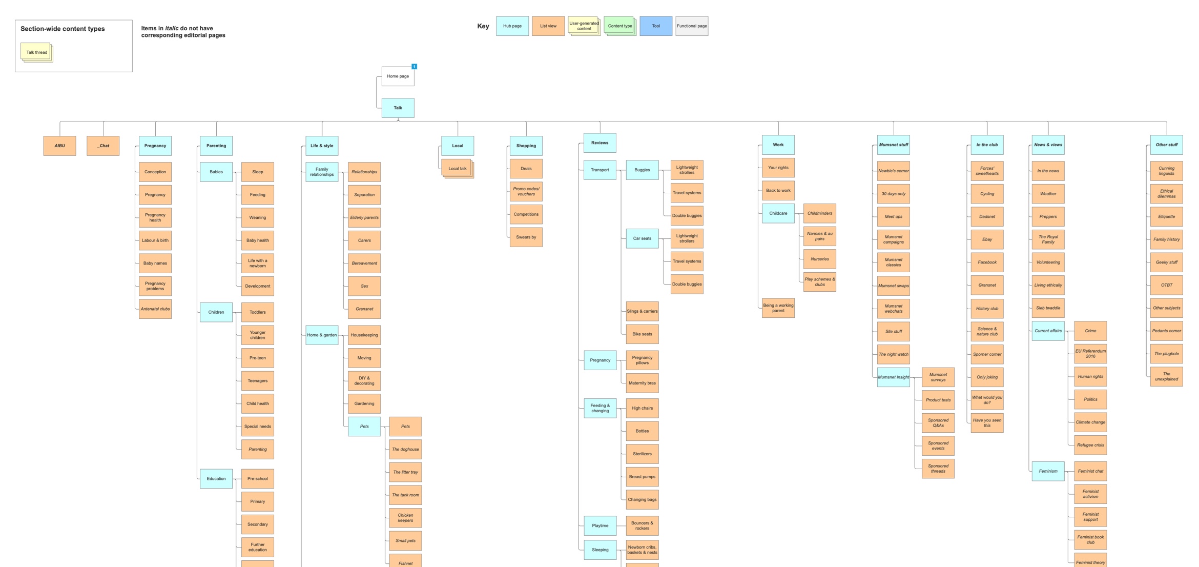
↑ Detail of the site map, showing the content structure.
Usability testing
Before beginning design and development work, I conducted a series of card sorting and tree tests with users both familiar and unfamiliar with Mumsnet. Setting a series of tasks, I asked people to find both top-level and nested content to make sure they could find it using the new site structure.
Design and prototyping
After the structure was agreed, I created a series of wireframes, prototypes and designs to test variations until we arrived at a solution liked by the majority of users.
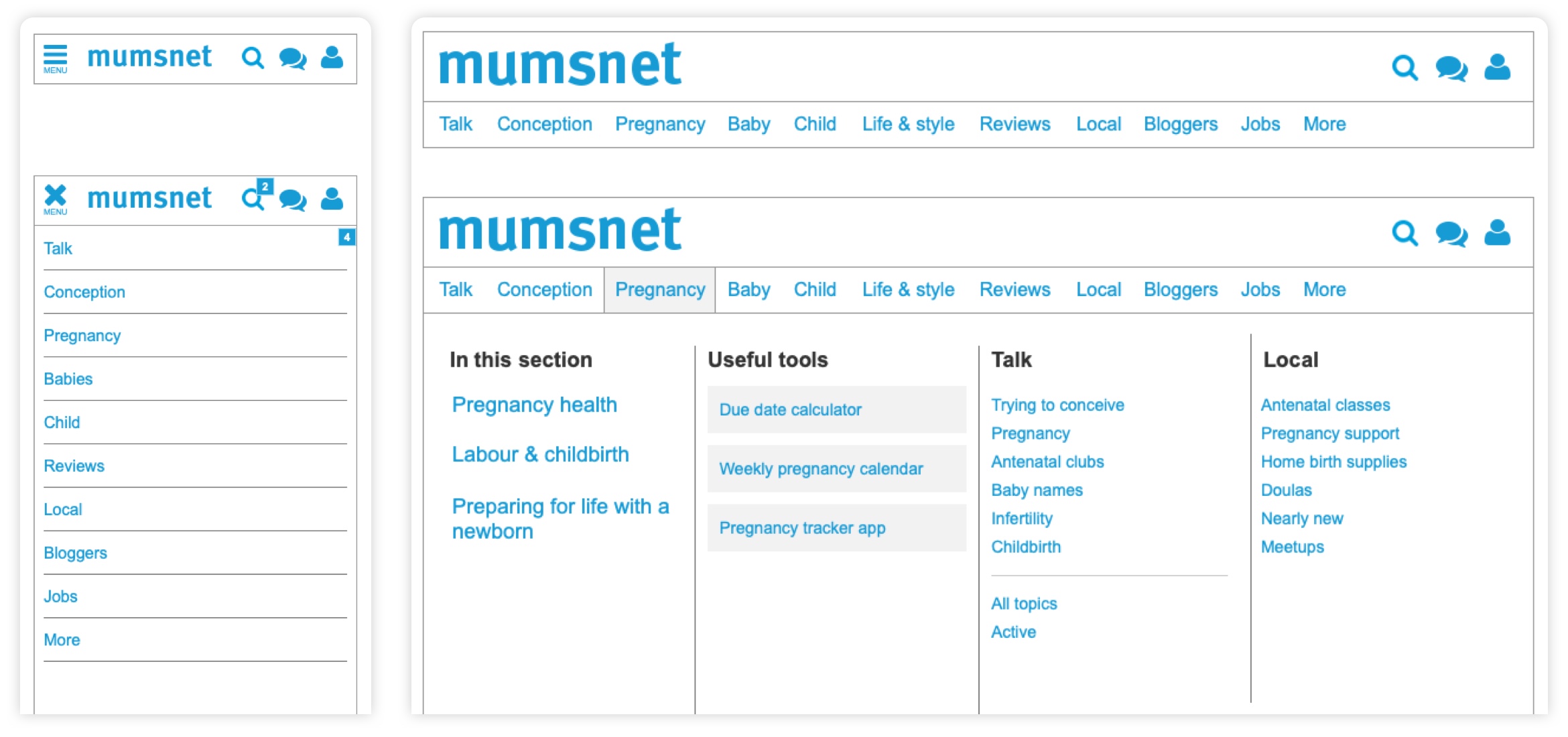
↑ Mobile and desktop wireframes, showing how the menu responds to different screen widths.
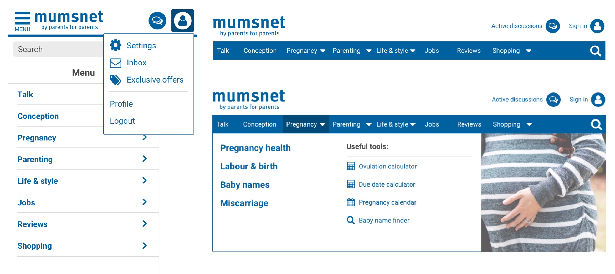
↑ The final designs, showing both mobile and desktop views. For SEO and accessibility purposes both views are built from the same HTML code, changing the CSS and JS at different breakpoints for full responsivity.
Development
Creating the new header and footer was a challenge. The code had to work flawlessly across desktop and mobile, be fully SEO optimised and accessible – and work on any page across the site without either breaking itself, or the surrounding page. I worked closely with the development team throughout this process to test code, make suggestions for improvements, and provide design guidance where necessary.
Launch
This was a big change to the site, much too risky to launch in one go. If anything went wrong, the backlash from our users would be fierce.
To mitigate this, I developed a staggered launch strategy, first releasing to 5% of users, and then upping the amount each week, until finally it was made available to all users.
Good communications with the community would be key to the new navigation to being accepted, so immediately after the launch I wrote a post explaining the rationale for the project and asked users to give their feedback. I triaged the responses, making rapid updates and changes based on the comments as they came in.
Outcome
Mumsnet users can be highly resistant to change, but due to the way I’d handled comments and the rapid post-launch improvements we made the new header and footer was accepted quickly.
After launch, the header click-through rate increased by 200%, and clicks to content increased by 77%.